
Part 01: Design Research

Design Brief

(1) What is the purpose (goal) of the design?
The goal of the Maison Hospitality Branding is to promote the company with meaningful design. The result will be a comprehensive look and feel to the brand with allusions to MHF key words: Dedication, Detail Oriented, Integrity.

(2) Who is the audience?
The target audience is likely young to middle-age adults. This brand will appeal to both males and females with a modern feel to the brand. Geography is likely west coast areas ranging from middle to upper class housholds.

(3) What message needs to be communicated?
The message that needs to be communicated is Maison Hospitality Furnishing is dedicated, detail oriented while valuing integrity.

(4) What is the competition and marketplace?
Competition includes Pottery Barn, West Elm, Restoration Hardware, Crate and Barrel, and Ethen Allen. These brands solved visual problems with strong emphasis on imagery and typography. Websites showcase their furniture/deals as the first thing you see.

(5) What is the context?
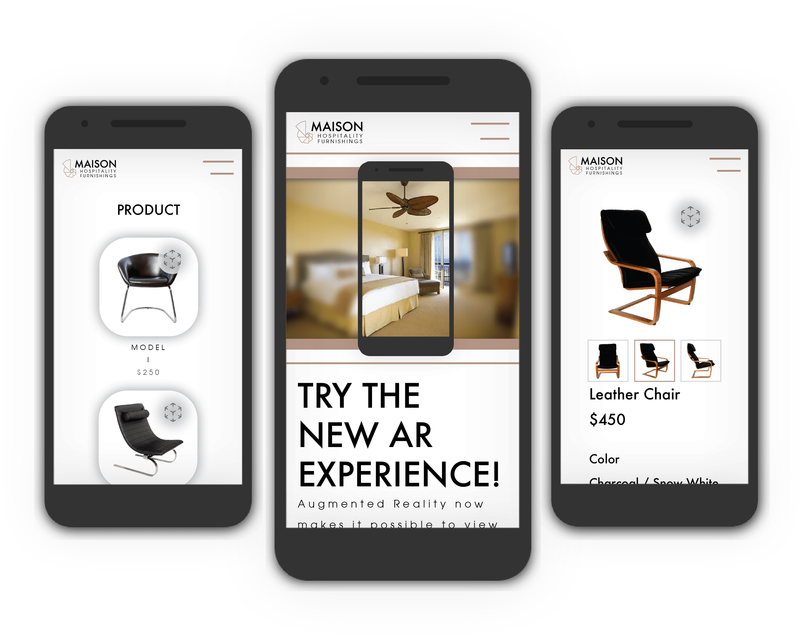
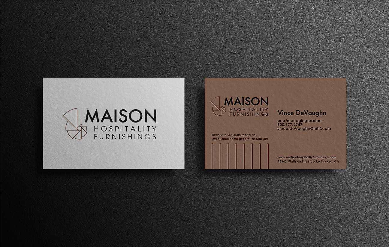
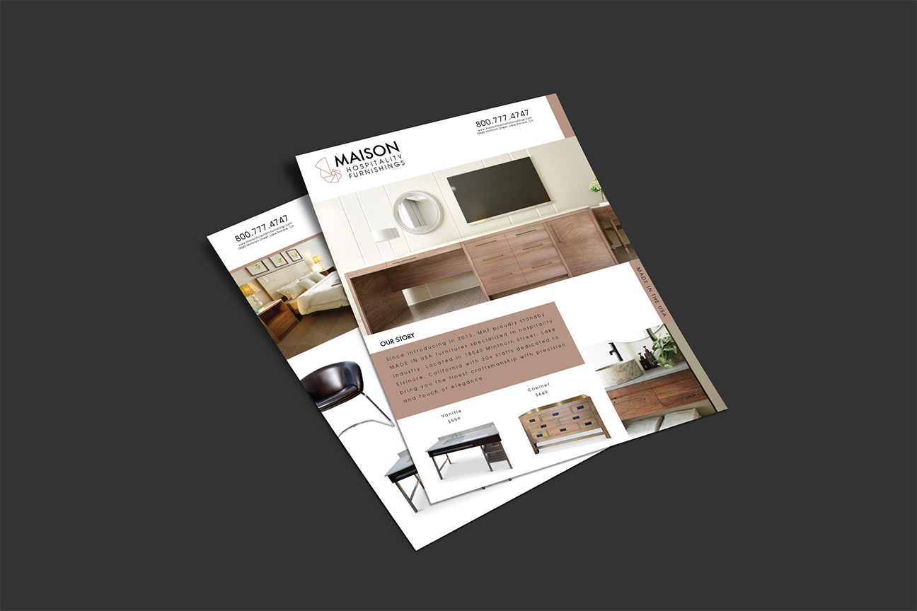
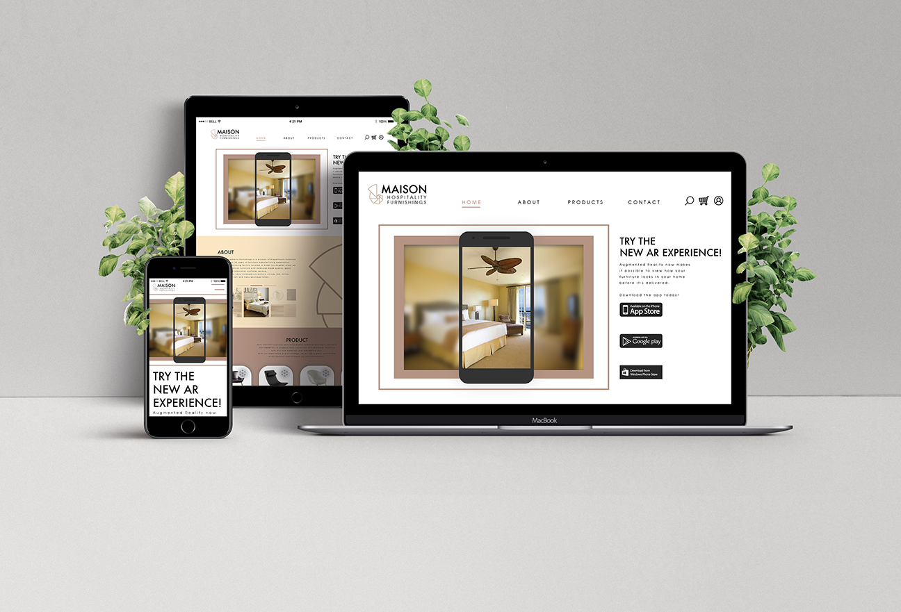
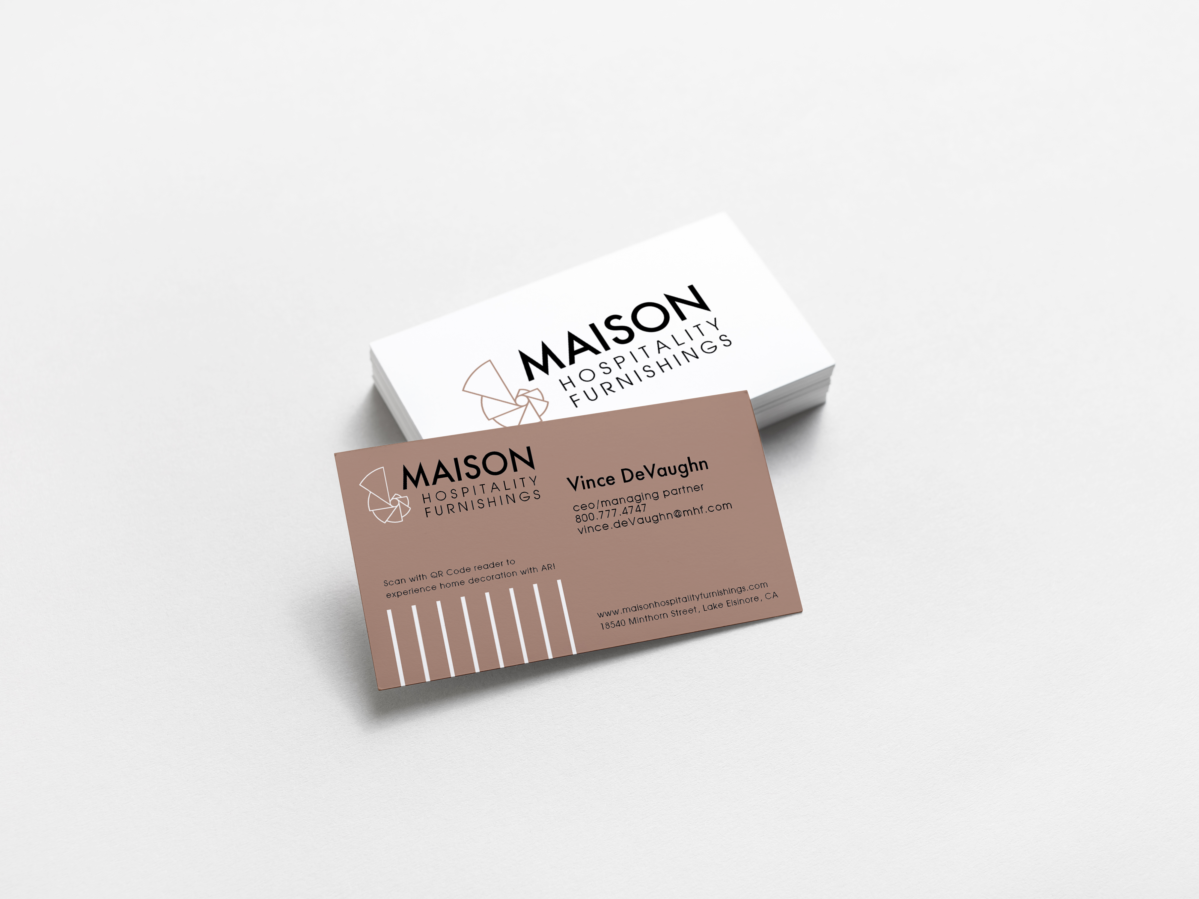
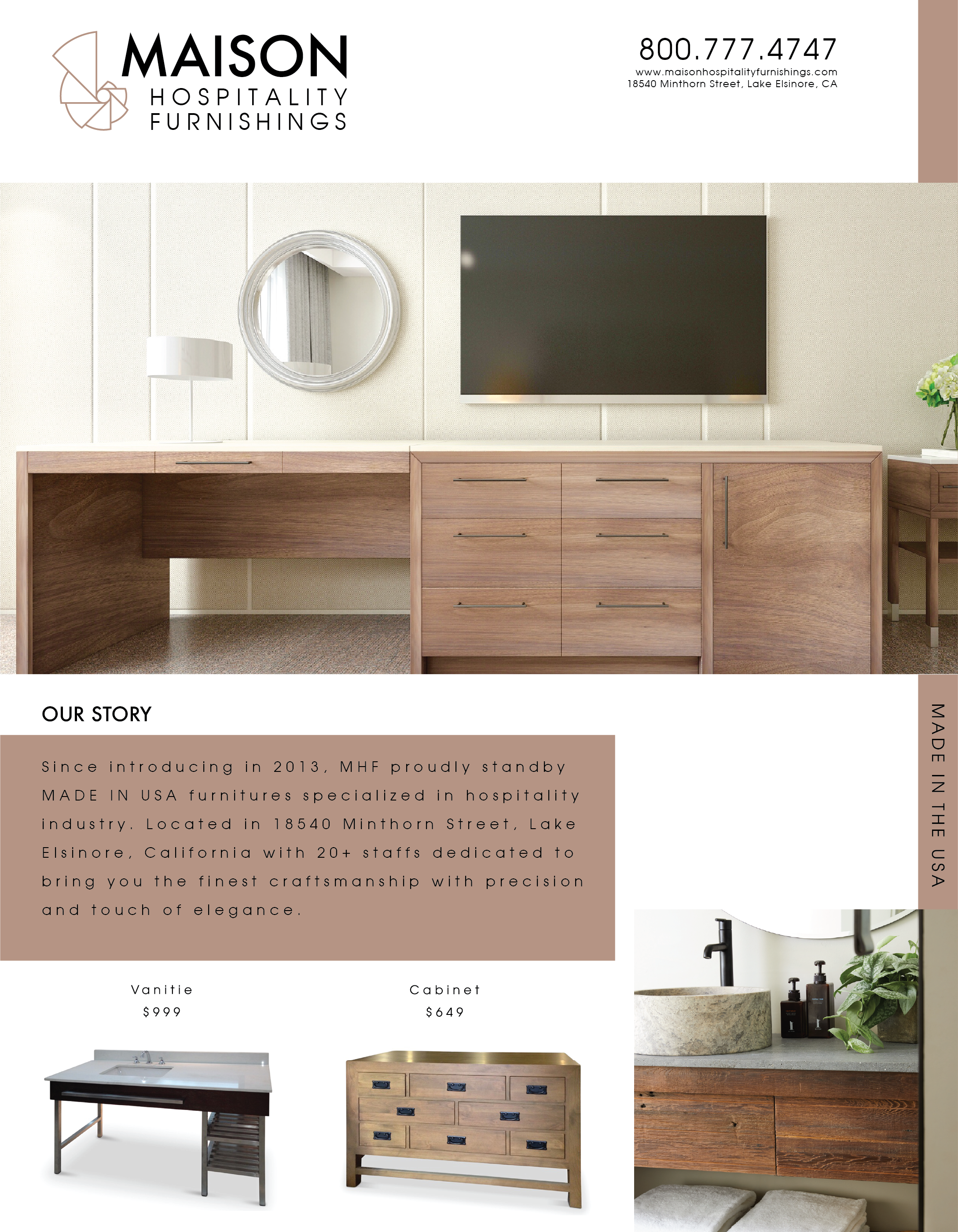
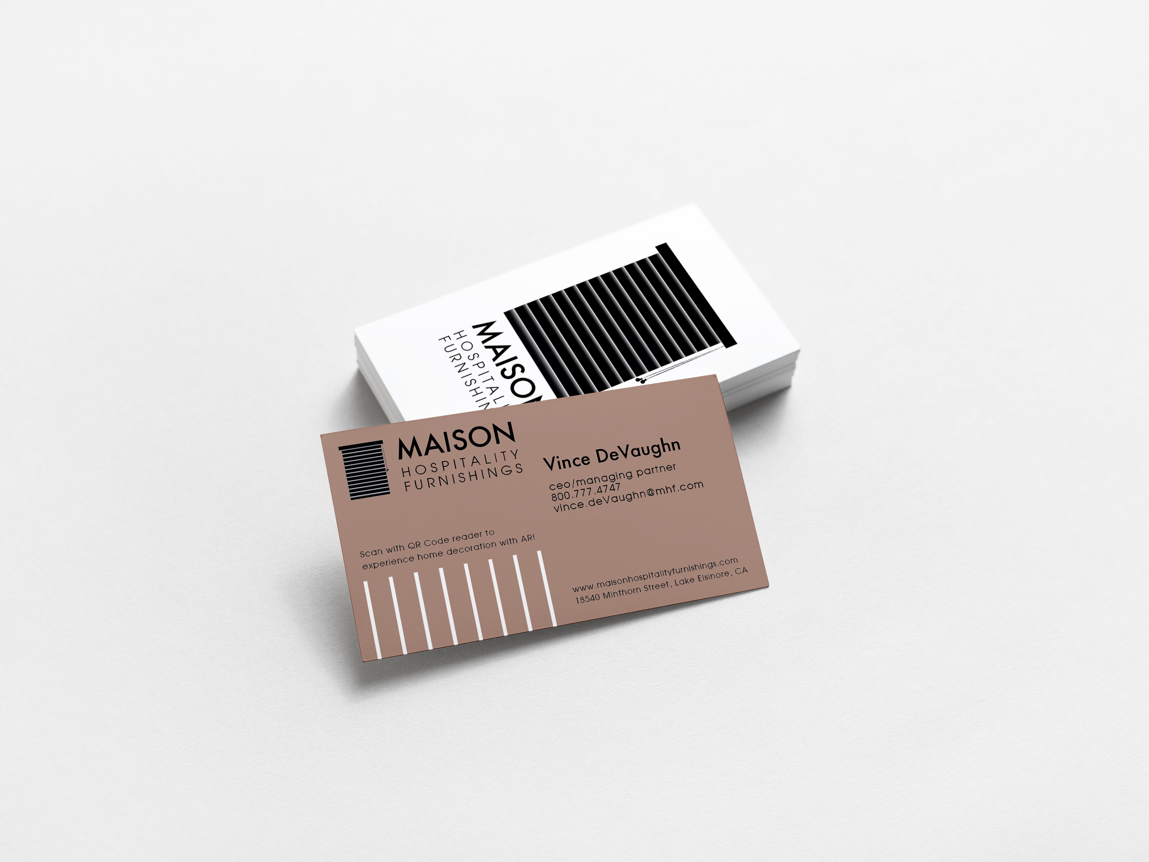
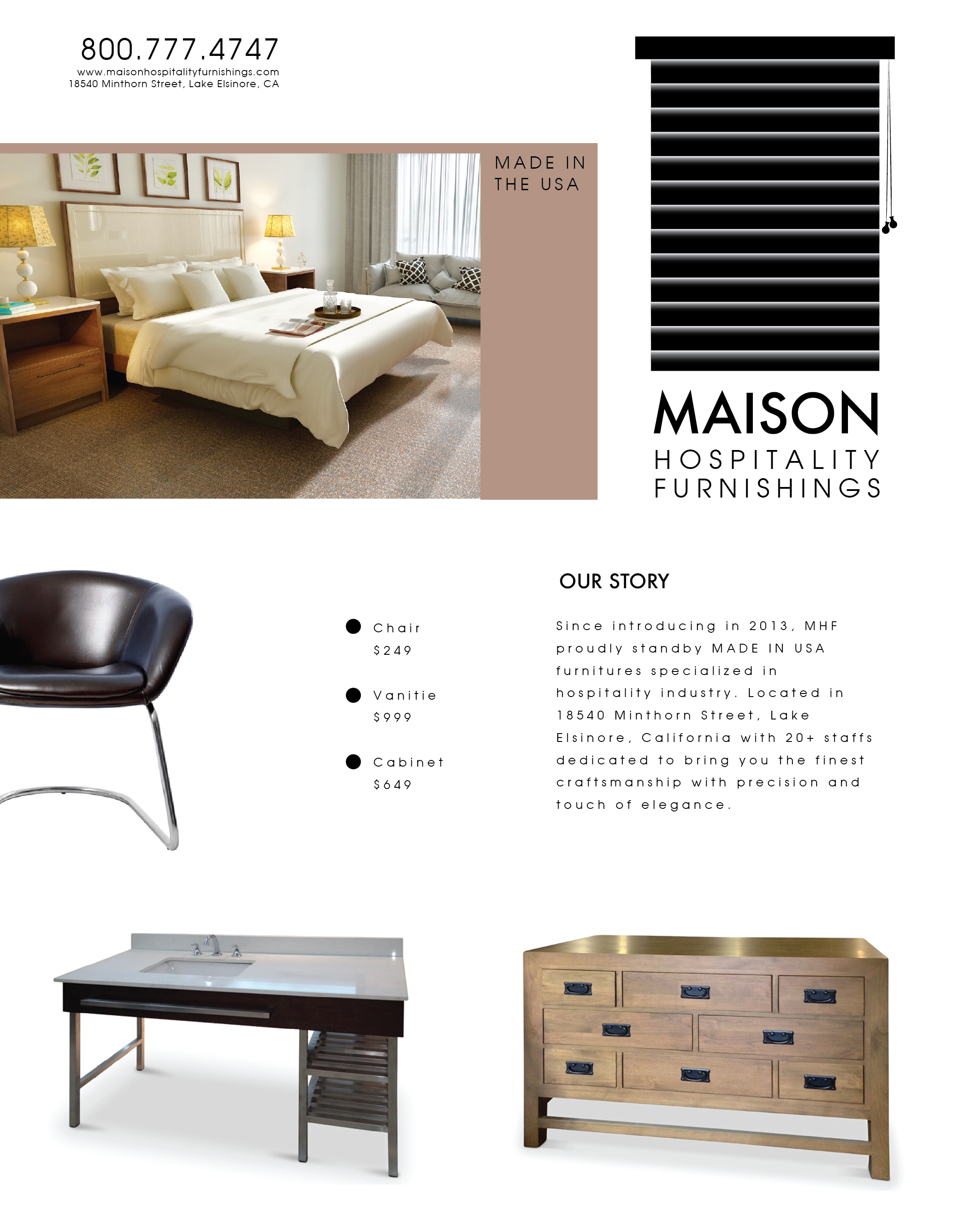
Designs will be seen in both print and web-based context. Desktop and mobile app versions will be designed to best fit the space for each respective device. Print-based will include promotional fliers, business cards, billboards, etc.

(6) In what voice?
The personality is serious and friendly. Five adjectives to describe the brand: Strong, Modern, Industrious, Bohemian.

(7) What kind of response is desired
Get the audience to react, to feel, to engage is the main objective. We want the audience to feel secure and comfortable with their purchases.

Type Faces

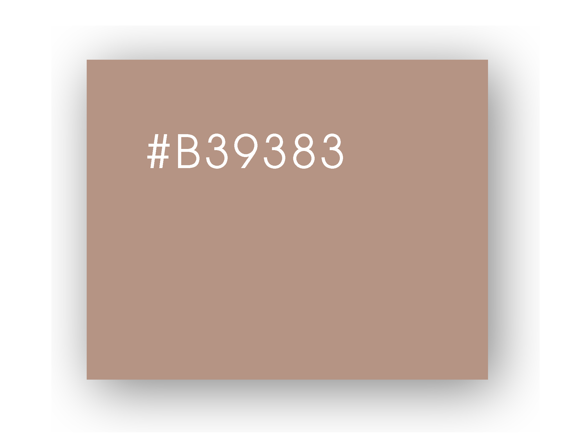
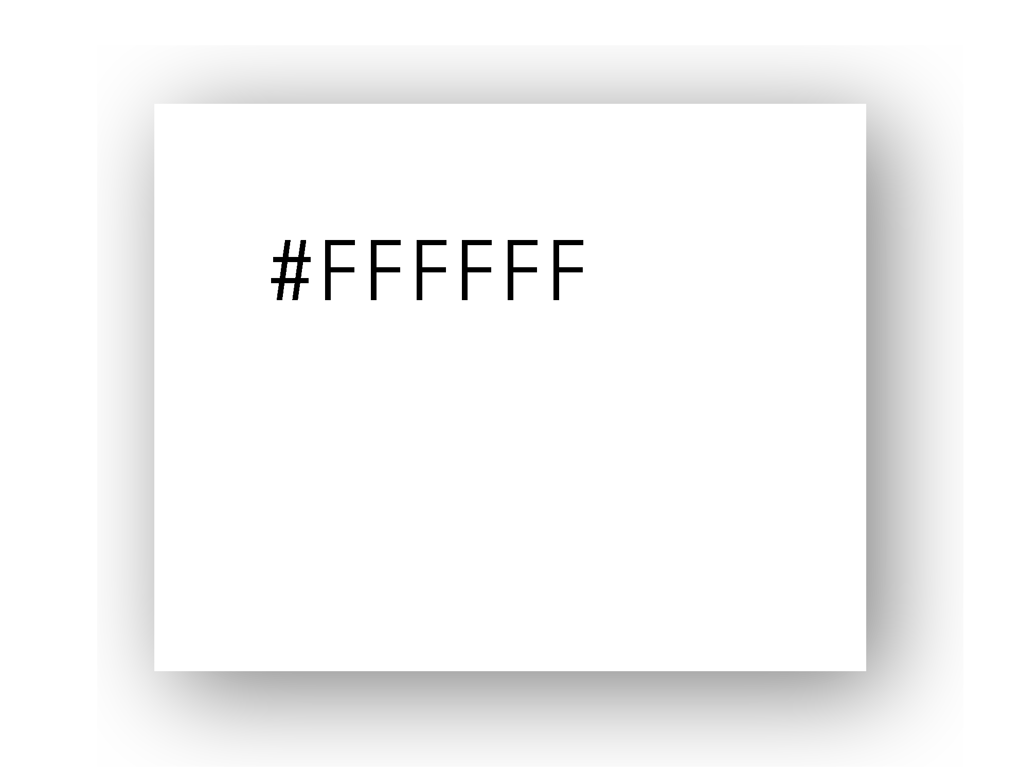
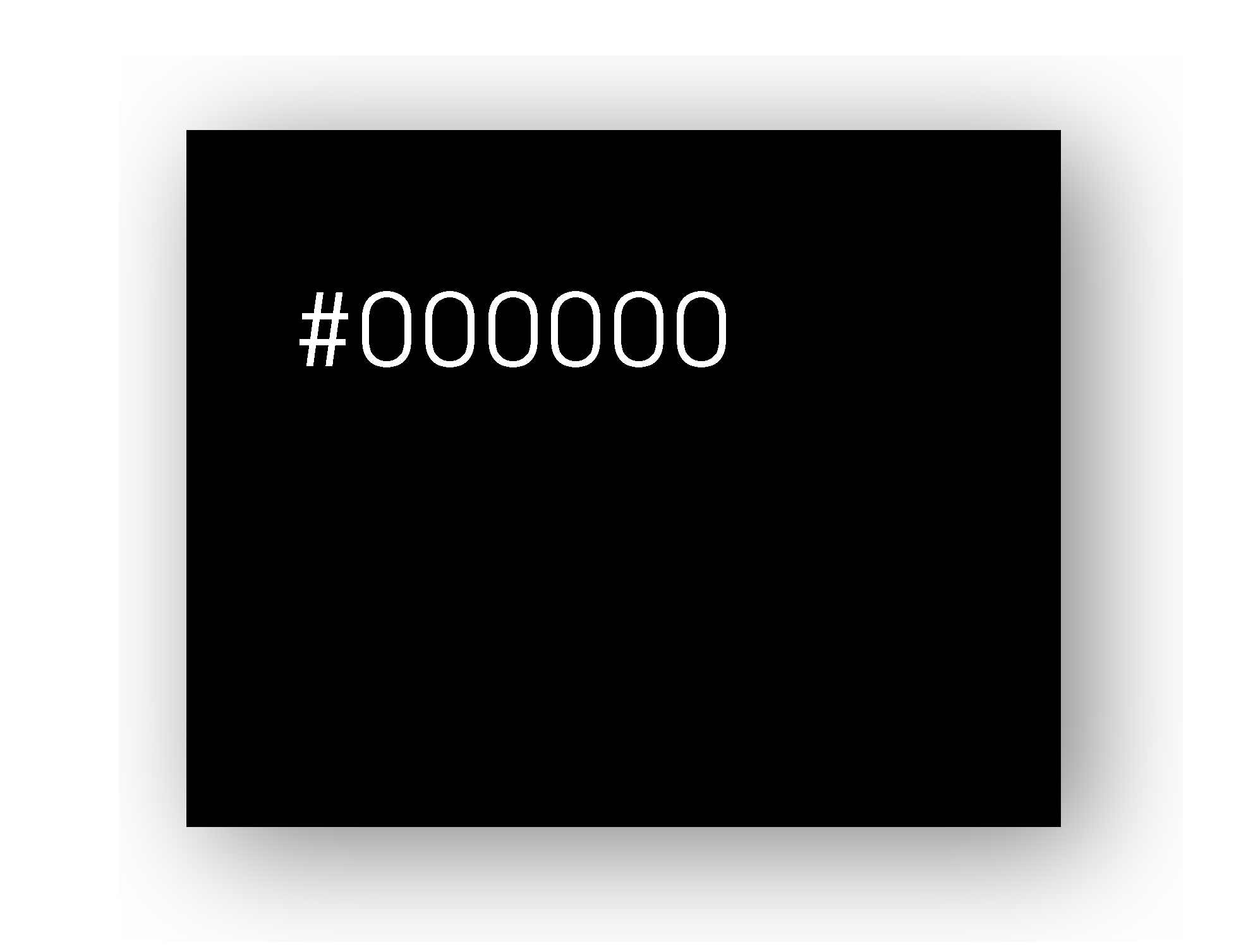
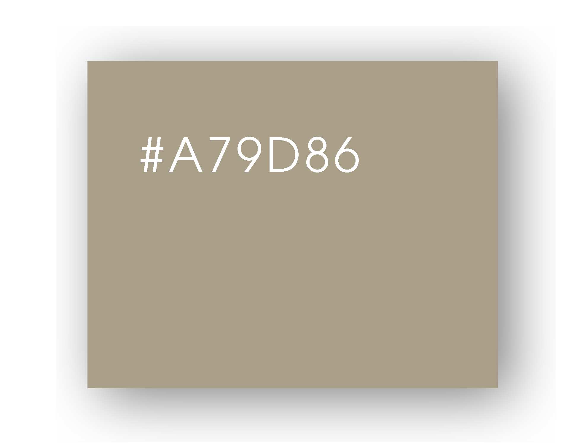
Colors

Logos


Part 02: Logo Application

Design I

Animation

gif

Application

flyI
flyI

Design II

Animation

gif

Application

gif
gif

Part 03: Site Map

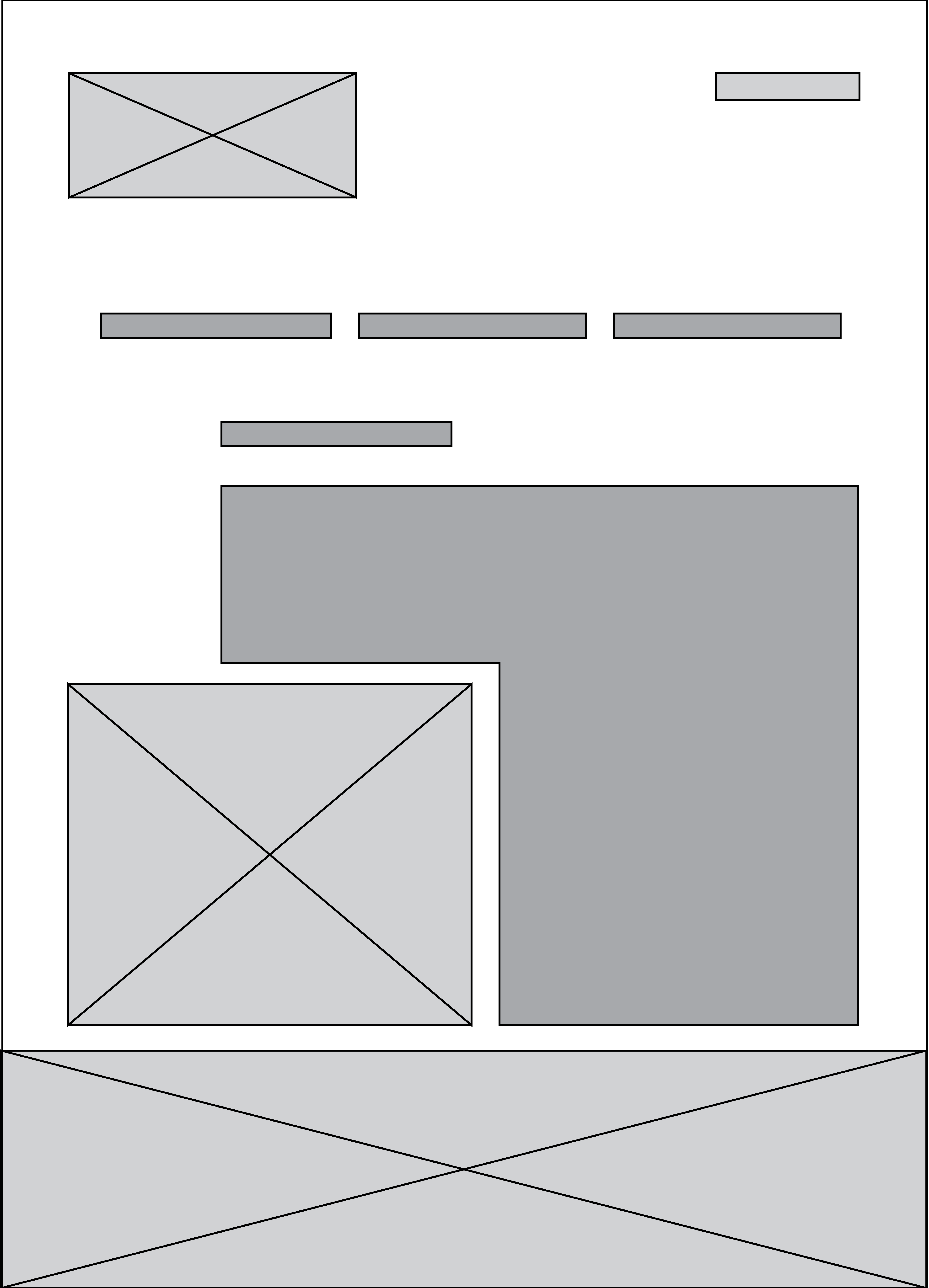
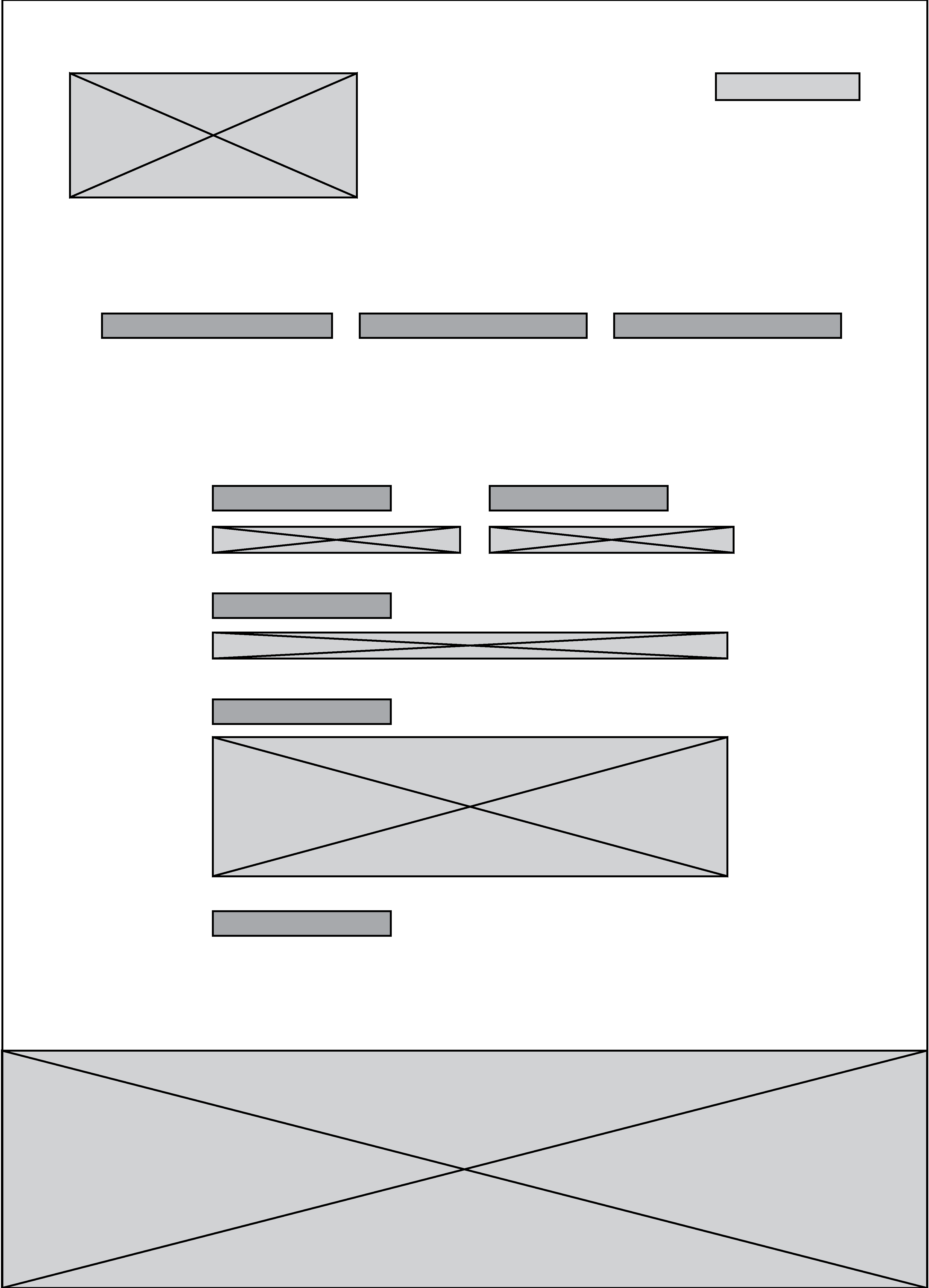
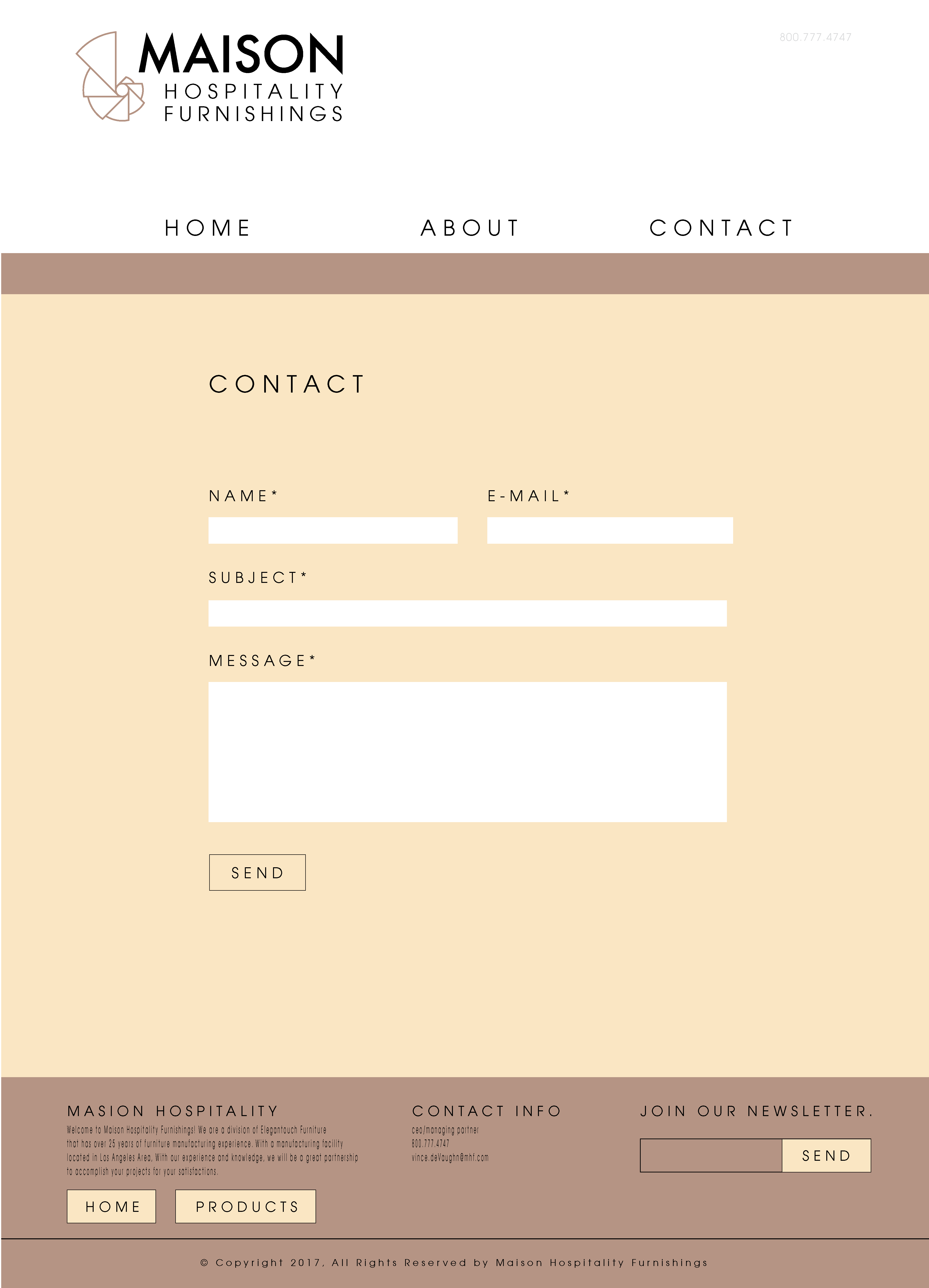
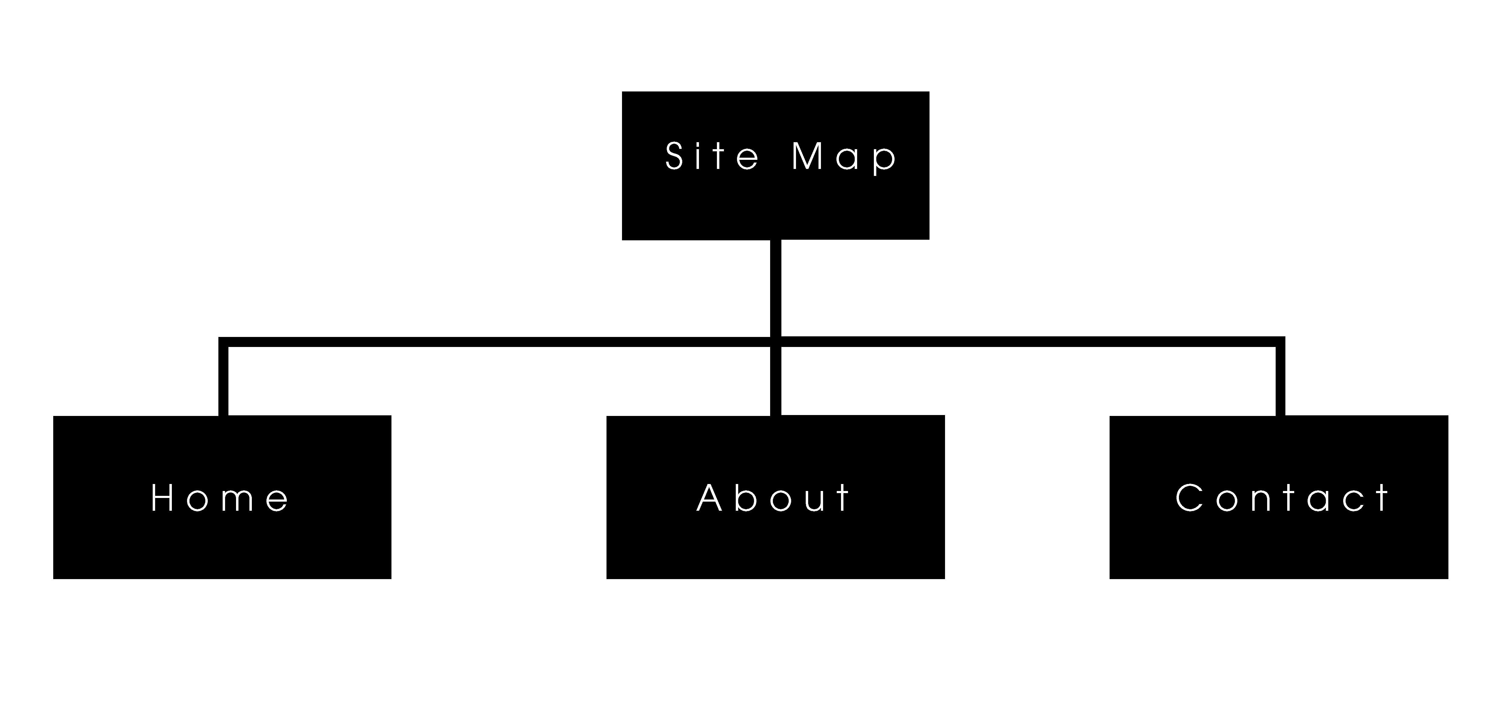
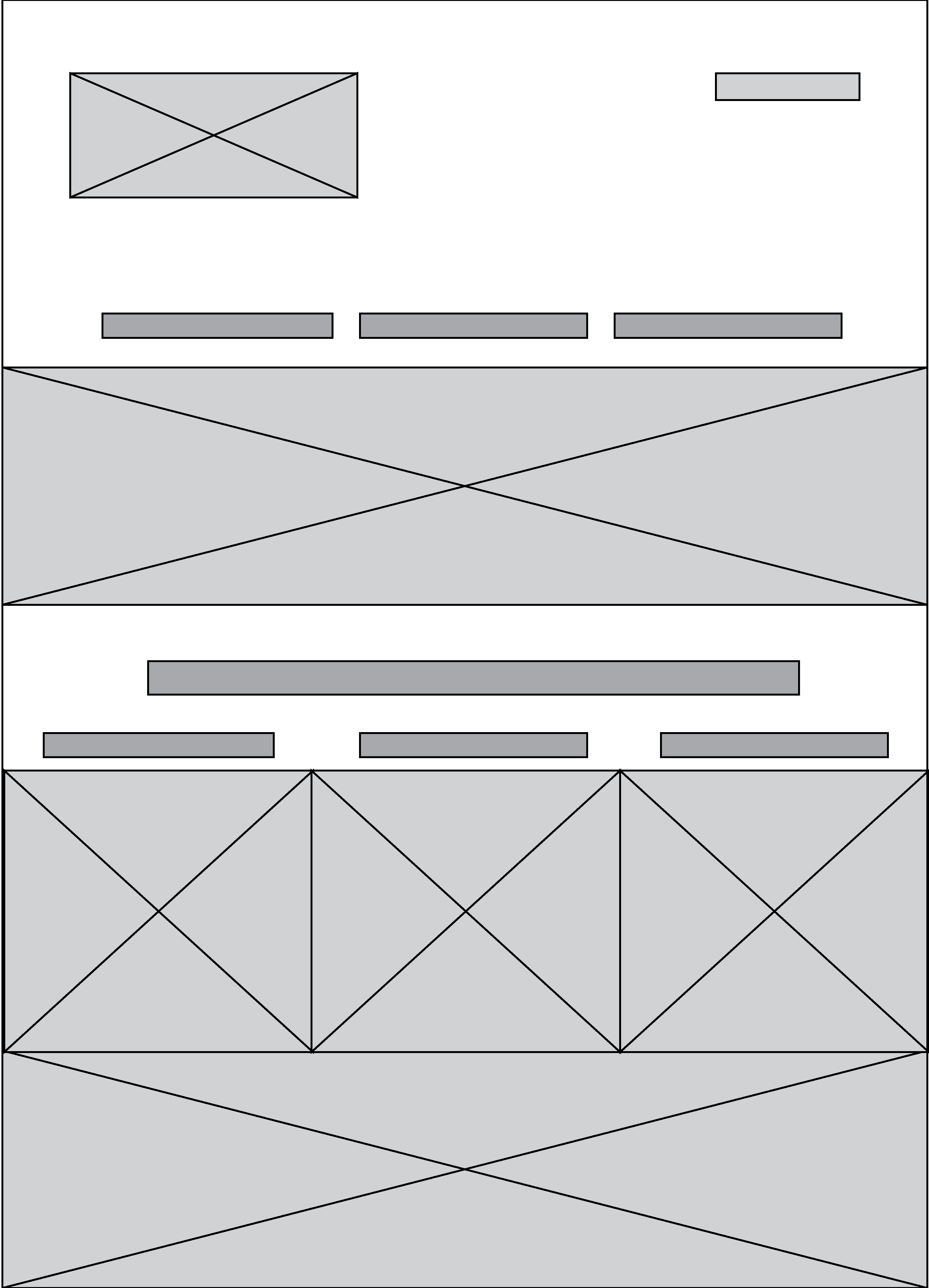
For my first attempt at redesigning the clients website I followed a blueprint of the original site design but added a new color palette that would serve to unify the brand in a more conventional way.
gif
gif
gif
gif
gif
gif
gif


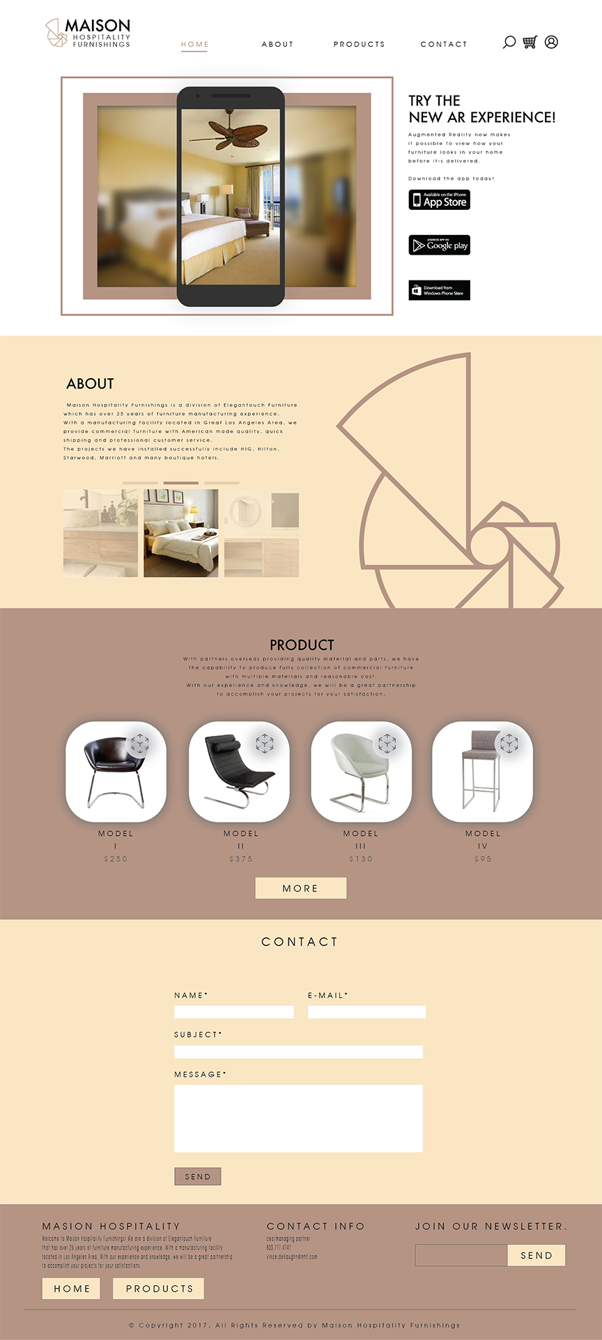
After taking a long hard look at what I had produced I realized the theme created was way to "early 2000". With a smile on my face and my knuckles cracked, I decided to take another go at making something that could really wow any customer visiting the site. The target audience is always the most important part to keep in mind when designing and after showing a few adults (50+ years old) the original layout, I realized that giving them to much control over figuring out how to navigate a webpage is actually counterintuitve. This is when I looked into different ways to control scrolling and found a JavaScript plugin called 'Scrollify' that would aid in just that!

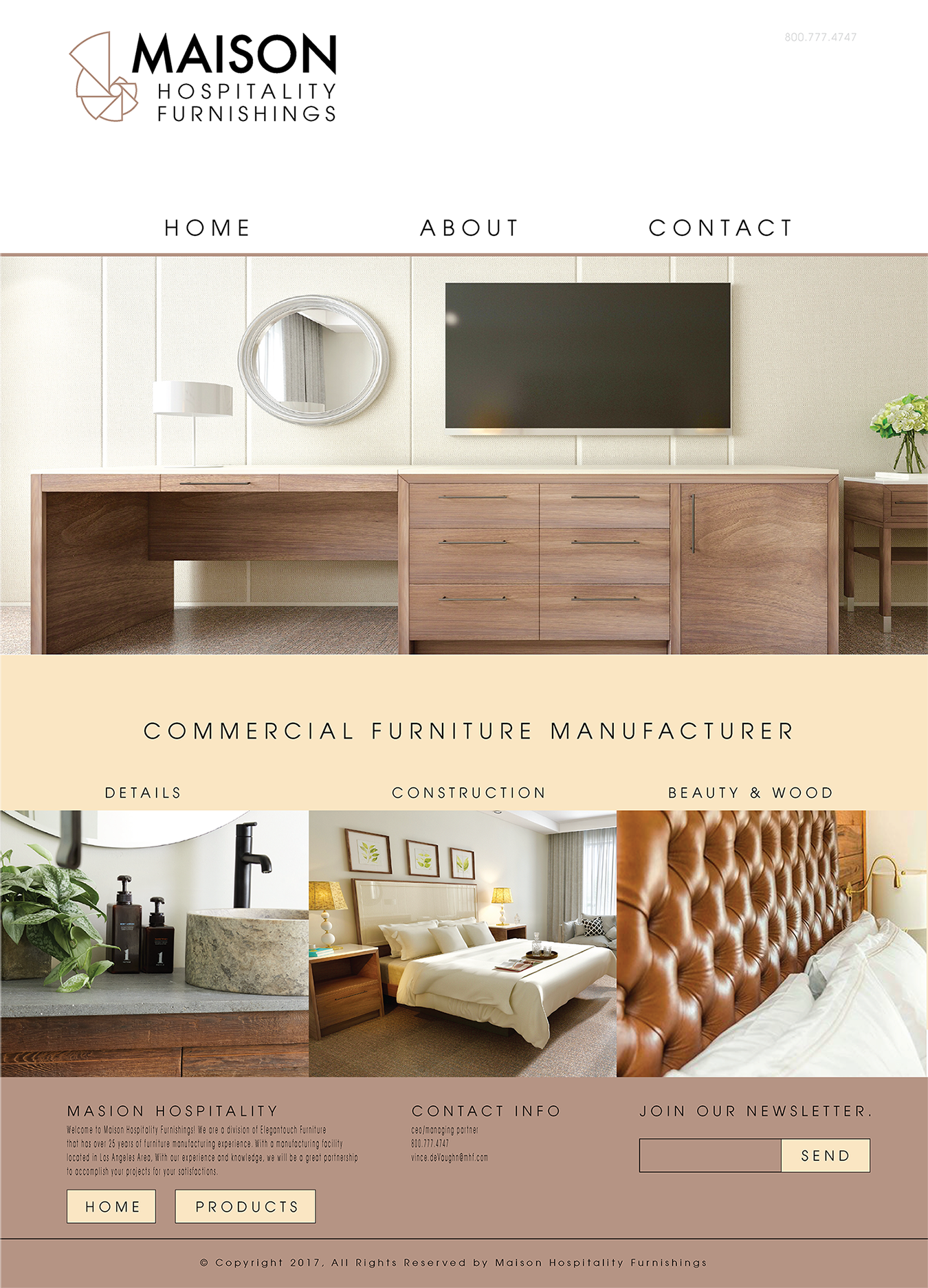
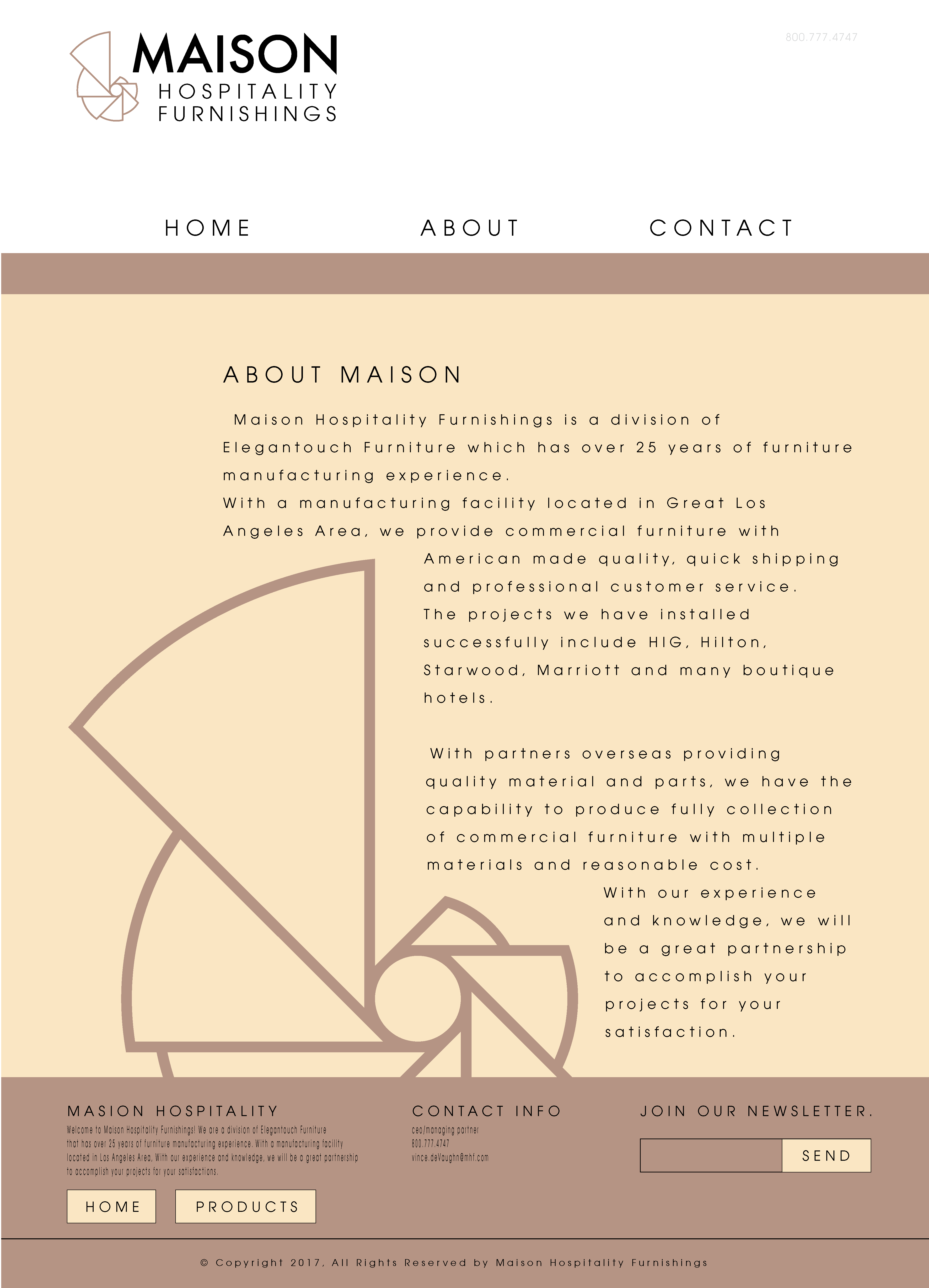
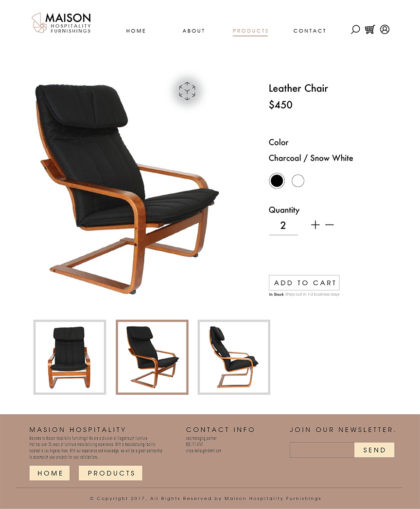
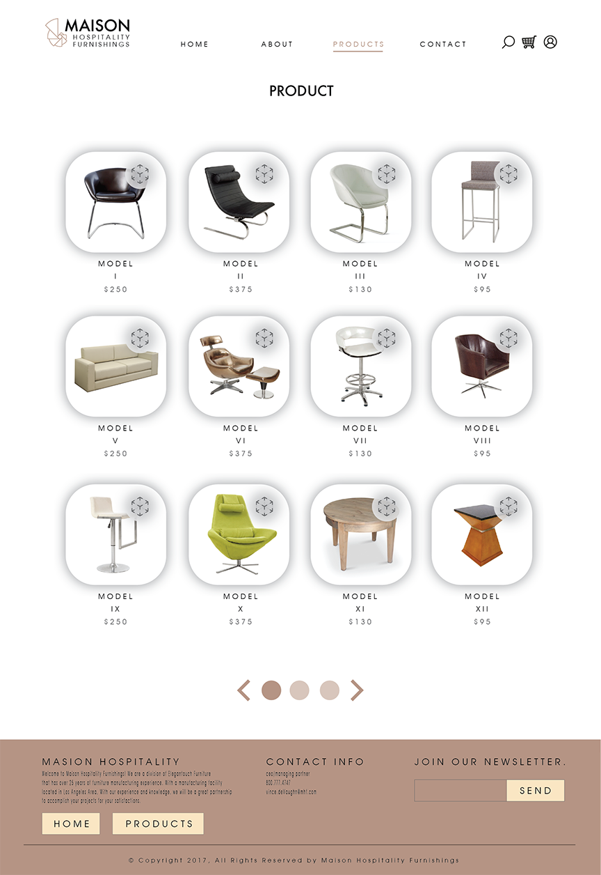
Here we have a design that is not only beautiful but is constructed with the user objective in mind. All advertising information is left on the Home page along with any Contact and About informaton while all other pages are purely product related. This helps ensure all customers are made aware of any new promotions while guiding the consumer to the cataloge, allowing them to easly focus on the information they came to see.
gif

gif

gif
gif

Final Mockups

gif
gif
gif


gif

©Nathanael Moody | 2020